The Origin
Modern apps try to do everything — and end up distracting us from the one thing we came to do.
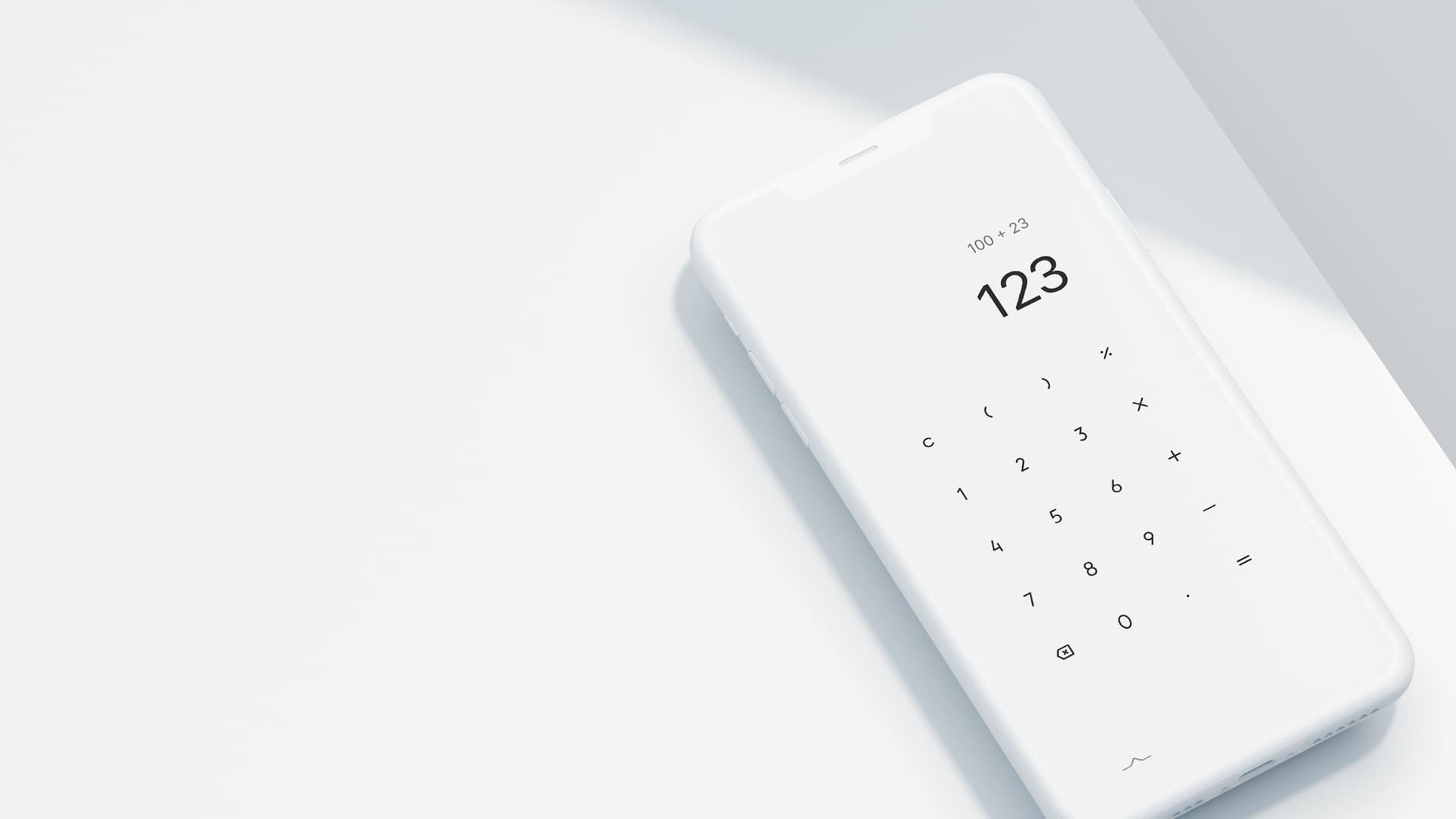
We open a calculator, a notes app, a to-do list — only to be met with ads, upgrade popups, and floating buttons.
The Minimal App Series was created to bring back clarity and focus.
The Problem We Noticed
Apps often try to add "value" by adding more features.
But what users often want is:
- A quiet space to input
- Fast, stable response
- An interface that stays out of the way
Designing less is harder. It requires restraint and intention.
Design Language
The entire series is built with a black, white, and gray visual language.
No extra colors. No shadows. No decorative elements — just what's necessary.
This also creates consistency across the series. Switching between tools feels seamless. There’s nothing new to "learn" — the UI disappears and lets the function shine.
Minimal Is Not a Compromise — It’s a Choice
We believe:
| Most Apps | Minimal Series |
|---|---|
| Feature-packed, heavy UI | Single-purpose, light UI |
| Business-first | Experience-first |
| Notifications, achievements | Quiet, clean, distraction-free |
That doesn't mean we don’t care about features — we care about when they appear, how, and why.
Released in Chapters
This is not just a few apps — it’s a continuous project.
Each app will be released as a "chapter," unified by design, but independent in function.
Each chapter is a small exploration of what “minimal” can be.
Stay tuned.
Final Note
The Minimal Series is not chasing trends.
It’s a quiet answer to the noise and fatigue we face every day.
If that resonates with you, try our apps — or send us feedback.